Revisiting Data Visualization

As data consumers, we sometimes get peppered by more information than we can cognitively process in a single moment. Thankfully, the well-established practice of data visualization helps us to condense large amounts of data points, trends and outliers into a visually digestible format. These visualizations can be as simple as a static line chart, or they can become more sophisticated as with interactive maps. For those of us tasked with presenting this data, we can leverage an array of visual tools to tell the story factually without dumping out raw data.
If you are among the stalwarts who must provide pages and pages of columnar data to satisfy an audit, this post is probably not for you. For those who want to produce or consume data visually, I will provide some basic points to consider when producing visualized information. But first, let’s take a look at an entertaining example of data visualization I found on Tableau Public, a free service where anyone can post interactive data visualizations. I will refer to this example in the points below (click the image to open, and be sure to interact with some of the chart data points):
Data Lens – Data Visualization Example
Some points to consider when producing visualizations for others:
-
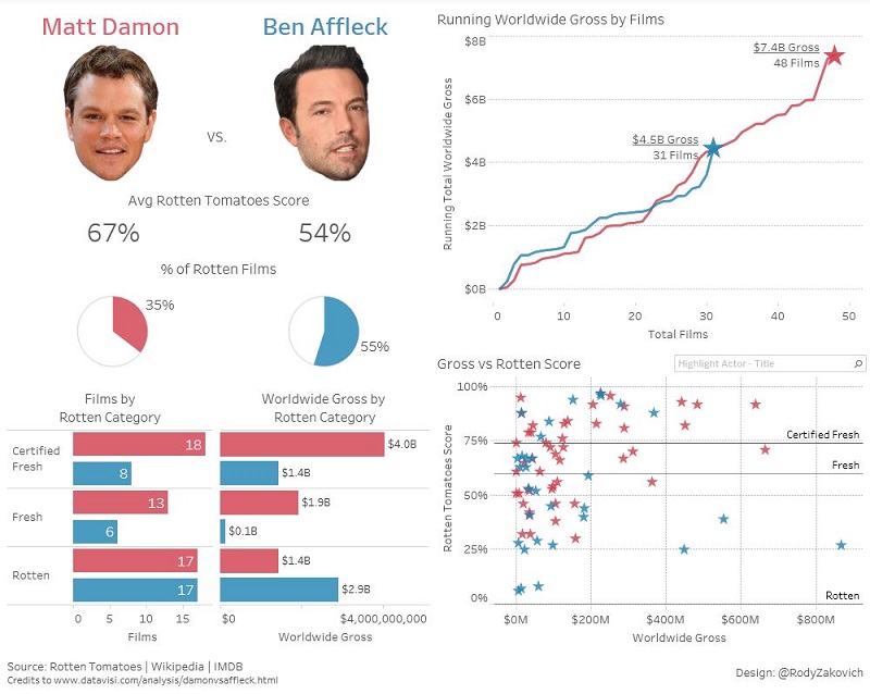
- Who will be your audience? This is the most basic question that goes into any presentation, and it is equally important when presenting data analysis. In our above example, fans of Matt Damon’s work might be interested in the diverse set of visualizations included here on both his film reviews and the worldwide gross revenue of his films. On the other hand, movie studio finance wizards have different needs with our example and might just want to see the raw numbers to measure: “How badly did the film Gigli really tank compared to Armageddon?” (I didn’t see Gigli, but I can say that Armageddon wasn’t Oscar-worthy). If the audience just wants the numbers, make sure they can get the numbers without being forced into using the visuals.
-
- Outline the complete story you are trying to tell. At a glance, each of your visualizations should summarize the narrative of what you are presenting. Often it may take more than one chart or graph to do this. If for example you are trying to illustrate your sales performance over a range of time that includes many impactful changes to your business (e.g. your company acquired another firm, added a business unit, expanded geographically, etc.), consider dividing the visualization into multiple parts that highlight the trends before and after the changes. In our example, we see that the analysis focused on two main measurements: the review ratings and worldwide gross revenue for each film. At least initially, it makes sense to create analysis for each measure. The analysis started with a focus on how well the films for each actor were reviewed, and then it flowed nicely into revenue comparisons. Four distinct visuals were used.
-
- Over the top visualizations are a distraction. Have you ever sat in the cockpit of an airplane or helicopter? All of the gauges look mesmerizing, and unless you are a trained pilot those gauges won’t help you much. The same goes for data visualizations. Visual indicators that resemble speedometers and other mechanized gauges were neat when they first appeared on analytical dashboards years ago, but as Stephen Few wrote in his book, Information Dashboard Design: The Effective Visual Communication of Data, overdoing it will actually degrade the presentation. The same holds true with today’s interactive visuals – fancy or feature rich visuals can work, but they should not detract from the narrative. In our example, most of the visuals are clean. They present basic data points in a number of ways, but that does not mean that they will work for every audience. I happen to like interactive scatter charts (used with the last chart shown) as well as heat maps and other visuals designed to plot multiple measures in one display. These visuals may make sense to some, but not all of the audience. Truly knowing your audience (step 1) and keeping the story clear are key guidelines.
- Help the audience draw a conclusion. The best visualizations allow you to make a decision or understand a trend in less time than it would take to hear an explanation. It helps the audience tremendously if you can answer a fundamental question decisively with a well summarized visual using the key data points in your analysis. A caption can be used to spell out the conclusion, but often a well-designed visual can do the job. From our example, the bottom-right scatter chart brings it all home by plotting all films by both actors across the two axes of this analysis: film review score and gross revenue. This visual illustrates a broad spectrum covering two film careers. From this excellent chart, you can draw several conclusions, not the least of which is a Hollywood edict: film review scores (measured by how high each “star” appears) have nothing to do with worldwide revenue (see Batman v Superman: Dawn of Justice).
Data visualization continues to evolve as both a technology and a discipline. With the right amount of creativity and detail, complex data patterns can be transformed into a digestible format that tell your story factually. Current data visualization software allows you to connect to virtually any data source to produce feature rich, visual analysis. Although they can be interactive and visually stunning, visual tools have to be used in a manner that works best for the audience. As in the movies, it’s not all about the special effects. The script is still what matters.
Many thanks to Rody Zakovich for providing the visualization example used in this post.