Be Nicer to Scatter Charts
For some reason, people really dislike scatter charts. They understand them well enough, but they do not LIKE them. These charts are also referred to as “scatter diagrams” or “scatter plots”, and that says a lot about their lack of popularity – nobody cares enough to know their name. I get it – scatter charts might appear too academic or mathematical at times. Presenters might cringe at the thought of showing a scatter chart to an audience eager to hear their latest analysis. They just aren’t cool enough to replace those bar or line charts you have used forever – especially those old 3D-style charts everyone loved.
The problem is that people have become so much better at interpreting data and could use some better visuals. Scatter charts are used best for “discovery level” questions, and when you are a data storyteller, you need a variety of visualization tools. Let’s give these scatter things a second chance. I will illustrate some examples using actual YouTube viewing statistics, which I have filtered down to a set of unique videos that had been published for the same number of weeks.
This next part gets a bit chart-ish. The familiar line chart (below, left) plots a single measure (video views) on the Y-axis and a static time-series (day of the month) on the X-axis. To the right of that line chart is a scatter chart. Looking like a total mess, this chart is showing two measures from each video being plotted: the count of views for each video is on the Y-axis, and the number of YouTube user “likes” is on the X-axis. This visual makes much more sense to a user who is asking a discovery-level question such as, “Do Likes really drive the number of views?”
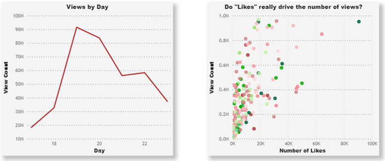
The familiar line chart followed by a… well, scatter chart
As a general definition, a scatter chart is a set of data points plotted against two numerical measures. On the X-axis, we typically plot the independent variable, which can be thought of as the cause in a cause and effect relationship. On the Y-axis, we plot the dependent variable, which is the measure that might depend on the first variable and represents the effect. Notice I said “might”.
As with other chart types, scatter charts can use color coding to group categories of data points (e.g. video categories as shown above), or they can change the size of each plot point to visualize a third measure, such as the relative number of video comments.
Here are some discovery paths you might follow when using these charts:
Where are the outliers?
Users who are knowledgeable about the underlying data might expect to see outliers, and these charts make it easy to find them. In the scatter chart above, the data point at the top-right corner represents a video with high counts for both likes and views. In terms of the number of likes, this video might seem like an outlier, but not so for this analysis. The set of data points at the top-left represent videos with about the same number of views, but they have only 20-25% of the number of likes as the top-right corner data point. There can be multiple outliers, both good and bad.
For another perspective with the above scatter chart, we could rename the X-axis to “Advertising Spend” and the Y-axis to “Total Revenue” for a set of cities (each being one of the data plots). If we then analyze the effect on revenue (Y-axis) with our ad investment in each of those cities (X-axis) we can identify potential outliers. Although the top-right data point appears to be in the top percentile for revenue, its relative ad spending was not in line with that of other cities producing the same revenue.
Does this impact that?
A second discovery path leads you to the relationship or lack thereof between the two data measures. In general, the broader the span or strength of the scatter, the less of a relationship (correlation) there is. A strong relationship between two variables would be illustrated by data points that densely form around a line or curve.
In our original scatter chart (below, left), we can see a somewhat weak relationship between the number of video likes and video views. Some videos have high viewership while having relatively low counts of likes. If we drill deeper into the video categories, we might find a category with a stronger relationship. The chart on the right zooms in on “category 10”, which contains music videos watched in the US. In this category we can see that the scatter forms around a line (although sparsely from this particular dataset), indicating that the number of likes may have driven the number of views.
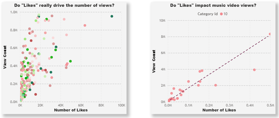
“Does this impact that?”: the stronger the scatter, the weaker the relationship
What does it mean?
YouTube viewers don’t likely base their entire decision to watch a video on the number of likes it has. But what about promotional or music videos? The point of using scatter charts is to take your analysis to the next level once you become familiar with your data measures. Finding out what key measures have a strong influence on others can help you make better planning decisions for areas where you expect a return on investment. This analysis can also identify the outliers that either exceed your normal expectations or fall far below them.
If you are still on the fence about using scatter charts, be nice and give them a test drive using your data. You might find you can replace two or more related line charts with a single scatter chart. People may not admit liking these scatter things, but they might like what you can discover with them.
Here are some more examples that might help you create your own discoveries:
Is this (Y-axis) impacted by that (X-axis)?
Is customer renewal income impacted by the number of account rep interactions?
Is our “new customer” count impacted by the amount we spend on ad campaigns?
Are total online orders impacted by the number of email campaigns?
Are equipment failure rates impacted by the number of weeks between maintenance checks?
Sources
Raw data for YouTube viewing statistics was sourced from Kaggle.